
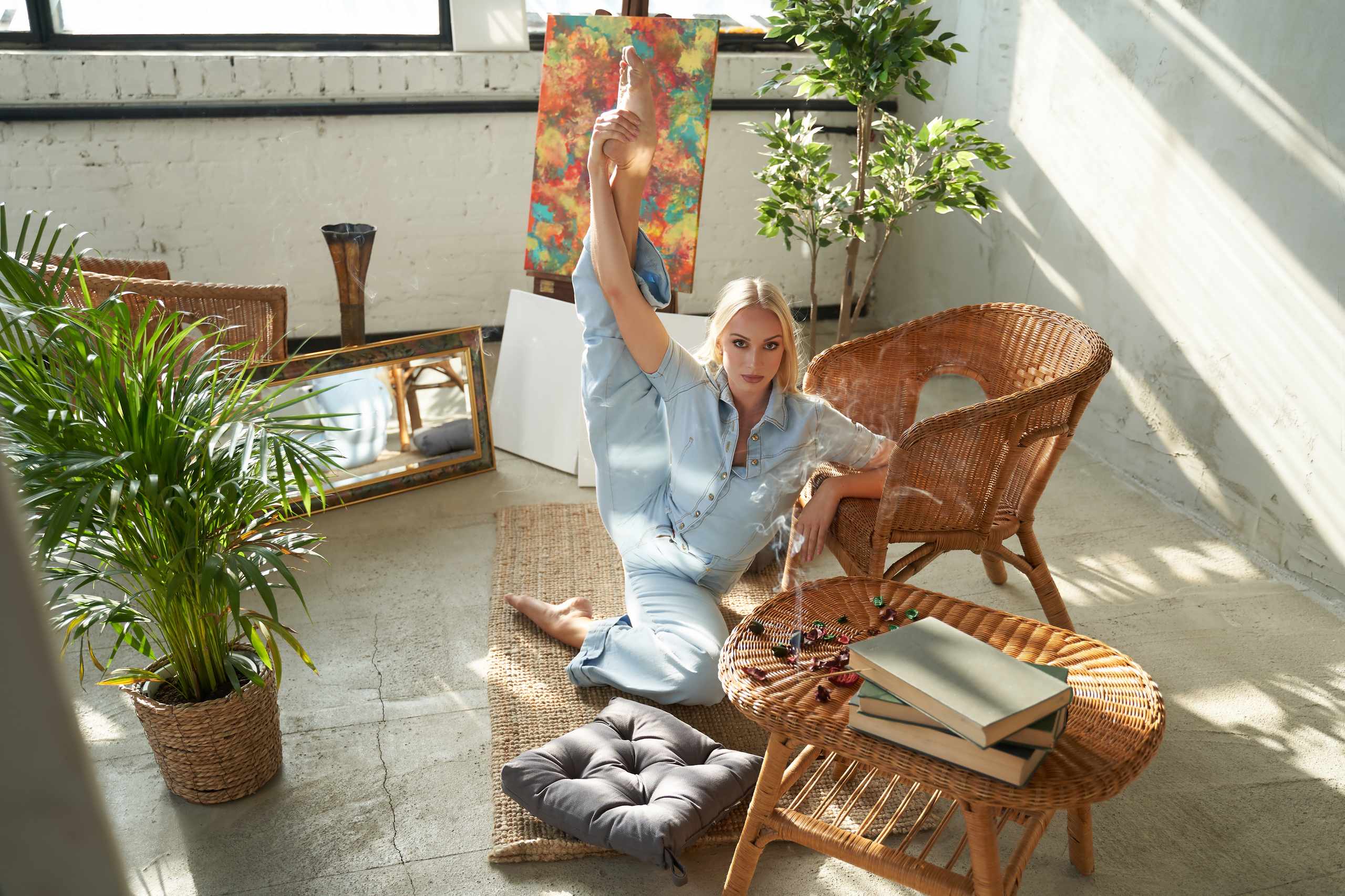
Color dilemmas typically stem not from color choices for a room, but from the room being conceived as a set of favorite colors rather than a unified space. A beginner loves these warm beige, dark olive, dusty blue, and dark accents but is confused why the room does not work. It is not your bad color choices. It is judging each color independently. Interior design color is all about how color behaves with lighting, fabric, and wood floor, and shadows. If you want to learn about color faster, do not ask, “Do I like this color?” Instead ask: “what does the room become when I put this color into it?”
To train your eye on color, start by simplifying variables. Select one room, and create a mini palette by picking just three colors from it: a primary color, a secondary color, and a contrasting color. You can do this with paint swatches, color scraps, clipped magazine pictures, and saved prints. Gather your mini-palette and put it next to your room in natural light. It makes all the difference in daylight vs. evening light. Look closely at your mini-palette in relation to the flooring, the sofa, the drapery, and the darkest corner of your room. Ask yourself, What is changing? An off-white color that looks creamy and light in the morning can turn very yellow and muddy in the evening. A blue-green might look sophisticated on wood flooring but look gray and muddy near light flooring. These mini-experiments are much more effective at teaching you color than just looking at endless Pinterest color pictures.
Color is most often chosen impulsively instead of based upon a plan. This is why many beginner interiors have three or more intense competing color choices. This is often because walls, upholsteries and decorative accessories are performing the same visual role. You must decide on the visual quietest color element (surface or furniture) and the visually dominant color element. The large surface areas in most interiors need less visual weight, so they do not compete with accent surfaces. When all areas of an interior have the same intense visual weight, there is no visual rest point. To see the issue visually, imagine that one visual color element is removed, and then look at your space without it. You often discover that it does not need a new color, just one less color.
Color choices can be improved through a daily color challenge, without getting tired of it. For 15 minutes, select one interior that you like, and then look closely at the colors. You do not have to copy the color palette, but observe what it is doing. Is it doing subtle tonal variations? Soft variations? A dark anchor against lighter tones? Then look at your room and pick objects you could use to recreate the color balance, whether those colors are similar or not. The goal is not a copy of the original image, but to learn the purpose of the color choices in it. Then, on a different day, take pictures of the same area of your home in different parts of the day and compare how the color choices have changed in daylight vs. evening light. You build an understanding about light, one of the hidden elements in successful interiors.
Choosing colors is usually stuck by making too many choices for yourself too fast. In those instances, start by choosing the overall mood of a space, not its color palette. What mood does the space require? A quiet and peaceful space, or a fresh and clean space, or a dark space, or an intimate and cocooning space, or an air space and light space, or a dark space and an anchored space, or a space with a dramatic mood? Once you decide the mood, you can begin to make fewer color choices.
The colors you choose need to reflect your overall choice. A quiet space needs softer color choices and less color contrast. A dramatic space can take on more color contrast, but must still be intentional in its color choice. And if you are still unsure about colors, you can experiment with colors at the accessory level. Add color with a throw, a lamp shade, a board that you paint, or a fabric swatch rather than choosing a wall color before you are ready. The eye develops better color perception through repetition, adjustment, and moderation. After enough practice, color is no longer a mystery, but a combination of tone, weight, and visual mood.